“Smart Design” works in any environment. Branded Area delivers for our client at CES 2019
When Micron attended the CES show in Las Vegas they opted for private meeting space instead of a booth on the main show floor. They rented five luxury hospitality suites at the Venetian Hotel and designated them for pre-scheduled private meetings. They called on Branded Area to deliver consistent branding and messaging across these five environments.
There are unique challenges going into existing hotel space versus a “blank canvas” that a traditional tradeshow booth allows. Hotel spaces are obviously already decorated with a look and style that cannot be altered but needs to be complemented to make it your space and to make your branding stand out and flow within the environment. Our “Smart design” process went to work to deliver the right look.
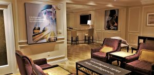
Our first design goal was to blend with the style and décor of the suites. A luxury hotel look but definitely not a high tech décor like Micron’s product would suggest.
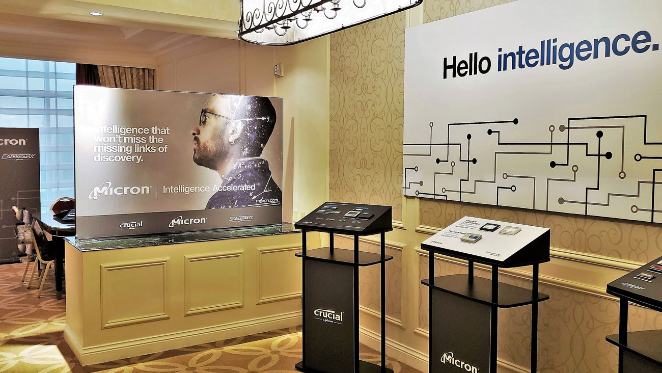
Our Solution – We utilized a series of soft SEG fabric graphics with black anodized aluminum frames to complement the existing décor. Tastefully designed graphics with muted tones and consistent black trim integrated well with the existing materials palette.
Hotel suites typically have very restrictive rules and regulations about what you can do in the space and what you can bring into the hotel. In the case of the Venetian that limitation included nothing over 6’ tall, nothing attached to the walls in a way to cause damage and nothing shipped into the hotel, only brought up to the rooms as if it were luggage. In other words, traditional exhibit display materials and delivery methods were not going to work here.
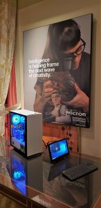
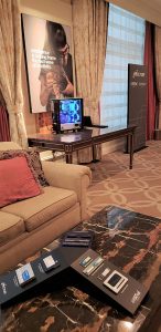
Our Solution – We Utilized knock-down portable product display kiosks and SEG fabrics on disassembled frames which allowed us to bring in small suitcase sized demos that fit within the freight restrictions. Tabletop product displays were stationed around the meeting spaces. Instead of attaching graphics to the walls we designed them to hang over the existing hotel wall art, eliminating attachment and avoiding added clutter to the room’s walls.
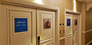
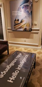
Thin message graphics that fit underneath the existing glass tops on many of the tables helped carry the brand throughout. We also designed rich looking door graphics on beveled clear acrylic that blended with the hotel’s rich materials in the hallways.
The final results promoted the client’s brand messaging without clashing with the existing environment. Our cohesive design effort and experience created a “Smart Solution”.
Thoughtful design and attention to detail allows Branded Area to deliver environments that work!


